

How to Choose the Perfect Font and Number Style for Jerseys
Choosing the right jersey font is not just a design decision. It affects how professional your uniforms look, how easy names and numbers are to read, and how clearly your team identity comes across on the field. A great font for jersey lettering should balance style, visibility, and printing performance.
Whether you are designing uniforms for soccer, basketball, baseball, football, or hockey, this guide will help you choose the best font and number style for your custom jerseys.
Why Jersey Font Choice Matters
A jersey does more than display a team name. It represents the team’s personality, energy, and level of professionalism. The wrong font can make names hard to read, numbers confusing, and the whole design feel generic. The right jersey font makes your uniform look sharp, unified, and game ready.
What Makes a Good Jersey Font
The best fonts for jerseys usually share a few traits:
- Bold strokes that stay visible from a distance
- Clear letter shapes that do not blur together
- Strong distinction between similar numbers like 6 and 9 or 1 and 7
- Good spacing between letters and digits
- Compatibility with sublimation, tackle twill, screen printing, or heat transfer
In most cases, simple and athletic typefaces outperform decorative fonts.
How to Choose the Right Font for Jersey Lettering
Start with your team identity. A traditional team may prefer a varsity or block font, while a modern club may want a cleaner, sharper style. Then check readability. If the font looks great on a screen but becomes unclear from a distance, it is not the right choice.
Also consider the placement. Front chest lettering, player names, and sleeve details all need different visual weight. A font that works for a team name may not work well for a player name on the back.
How to Choose the Best Number Style for Jerseys
Number style is just as important as lettering. Good jersey number fonts should be bold, balanced, and easy to identify during fast movement. Avoid overly narrow, decorative, or highly stylized numbers.
For custom uniforms, the best number styles usually include:
- Block numbers for maximum readability
- Slightly condensed numbers for limited space
- Outlined numbers for better contrast
- Sport-specific shapes that match the uniform aesthetic
If your jersey has patterns or gradients, use a number style with strong contrast and enough outline thickness.
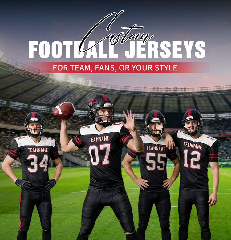
Best Jersey Font Styles by Sport
Basketball: modern, bold, dynamic fonts with clean edges
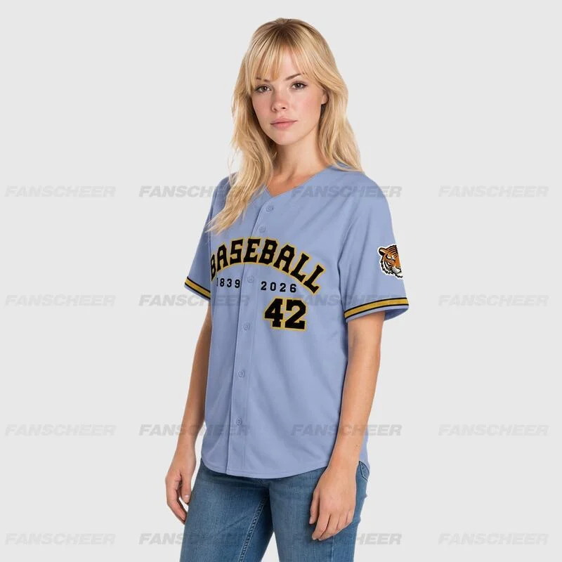
Baseball: classic serif or varsity-inspired lettering
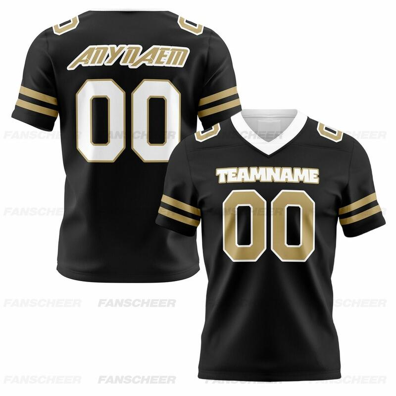
Football: strong block fonts with high-impact numbers
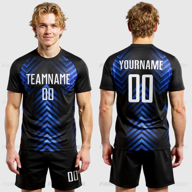
Soccer: clean sans-serif fonts with sleek, professional lines
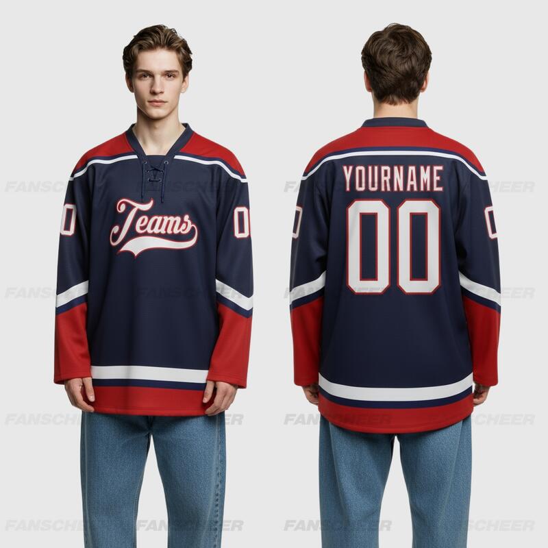
Hockey: heavier, wider fonts that stay readable on larger jerseys
Common Mistakes to Avoid
- Choosing style over readability
- Using thin fonts on dark or patterned fabric
- Ignoring spacing between letters and numbers
- Picking numbers that are easy to confuse
- Forgetting to test the font with the actual jersey colors
How Font Choice Affects Printing and Durability
Different decoration methods affect how fonts appear. Sublimation works best with clean shapes and consistent stroke widths. Screen printing and heat transfer also perform better with bold, simple lettering. Very thin lines, tiny serifs, and delicate outlines may lose clarity after production.
Final Checklist Before Ordering Custom Jerseys
Before finalizing your design, ask:
- Is the team name readable from a distance?
- Are the player names clear at smaller sizes?
- Do the numbers stand out against the jersey color?
- Does the font match the sport and team identity?
- Will the font print cleanly with the chosen production method?
A smart font choice can make your jerseys look more professional, improve player identification, and strengthen your team brand.
If you want custom uniforms that combine strong font for jersey lettering choices with durable production, Fanscheer can help you create jerseys that look sharp on and off the field.
FAQ
What is the best font for jersey lettering?
Usually a bold sans-serif or varsity-style font works best because it is clear and athletic.
What is the best number style for jerseys?
Block or slightly condensed numbers are usually best because they are easy to read.
Should jersey fonts be serif or sans-serif?
Sans-serif is usually safer for readability, but bold serif fonts can work for classic sports like baseball.