

10 Jersey Color Palette Ideas Inspired by the World Cup (and How to Pick the Right One for Your Team)
Choosing colors is the fastest way to make a custom jersey look professional—or messy. World Cup seasons are full of bold, memorable color stories, but the best palettes for real teams also need to be practical: readable numbers, consistent fabric appearance, and a look that works in photos.
Below are 10 jersey color palette ideas inspired by World Cup energy, plus a simple method to choose the right color scheme for your custom soccer jersey (or football kit).
How to choose a team-ready palette (the 3 rules)
Rule 1: Prioritize number readability
Pick a base color and number color with strong contrast. If you’re unsure, test it by shrinking a mockup to phone size.
Rule 2: Use the 60/30/10 split
- 60% base color
- 30% secondary color
- 10% accent color

Rule 3: Keep it consistent across the full kit
Make sure jersey + shorts + socks still look cohesive.
10 World Cup-inspired jersey color palette ideas
1) Classic Red + White + Navy
A timeless, high-contrast palette that looks sharp on camera.
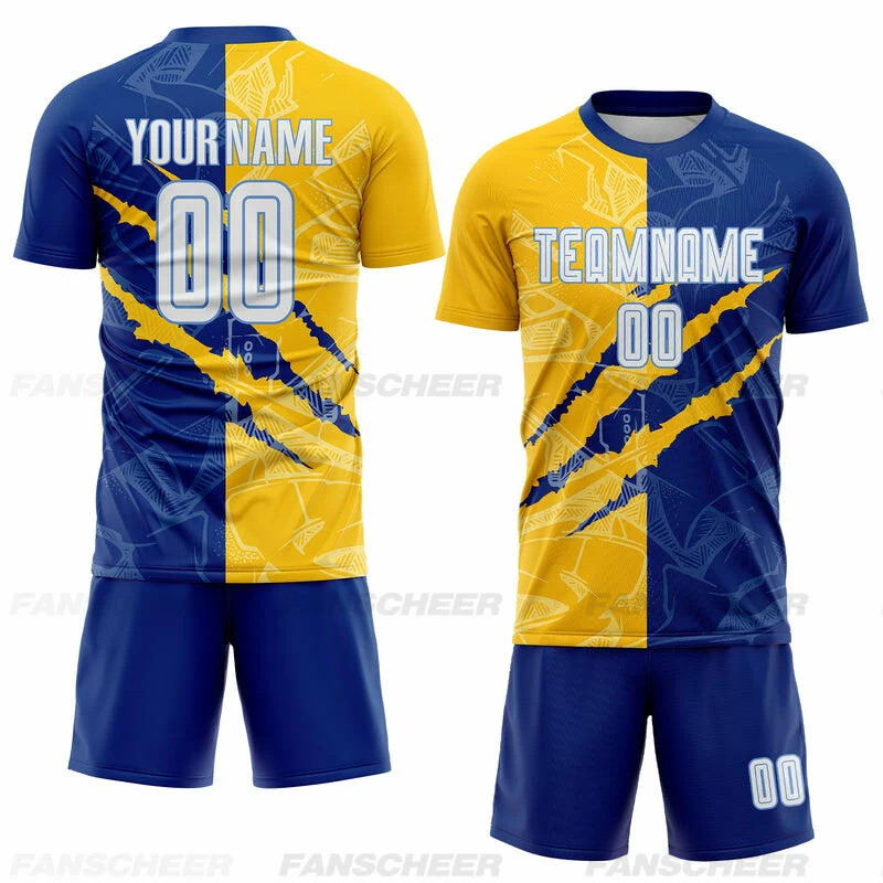
2) Royal Blue + White + Gold
Premium feel; great for clubs that want a “championship” look.
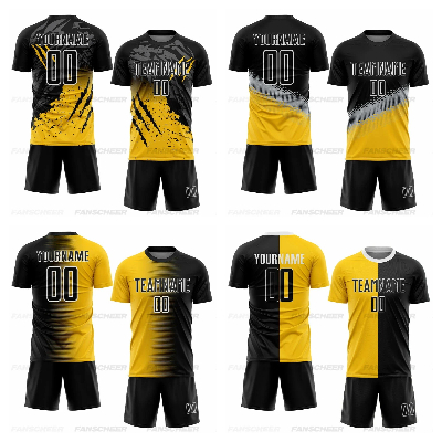
3) Black + Gold + White
Minimal, modern, and easy to match with accessories.
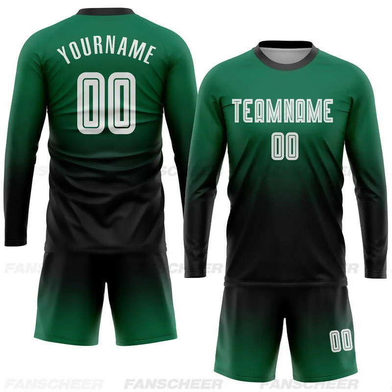
4) Green + White + Black
Fresh and sporty; works well with tonal patterns.
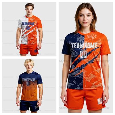
5) Orange + Navy + White
High energy; strong visibility in outdoor matches.
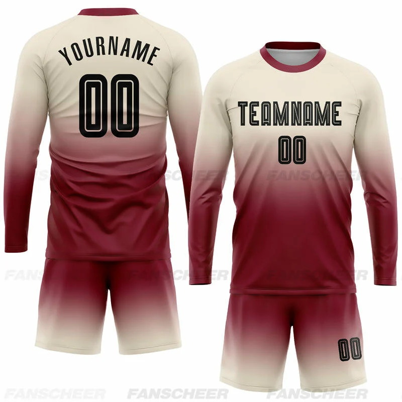
6) Burgundy + Cream + Black
A more fashion-forward palette that still feels athletic.
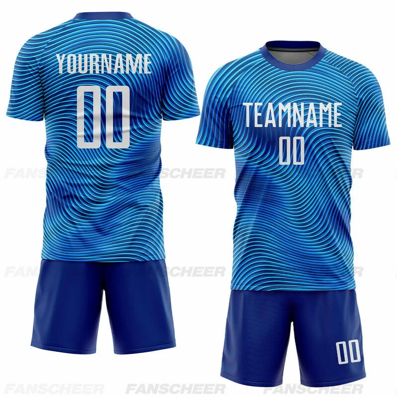
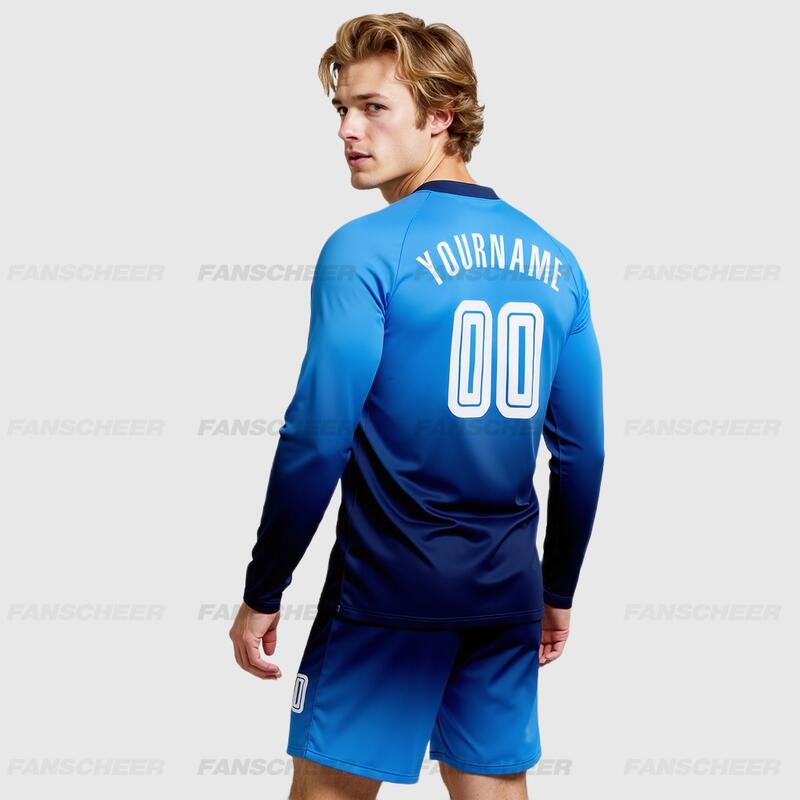
7) Sky Blue + White + Navy
Clean and airy; great for summer tournaments.
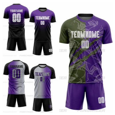
8) Purple + Black + Silver
Distinctive and modern; best with simple geometry.
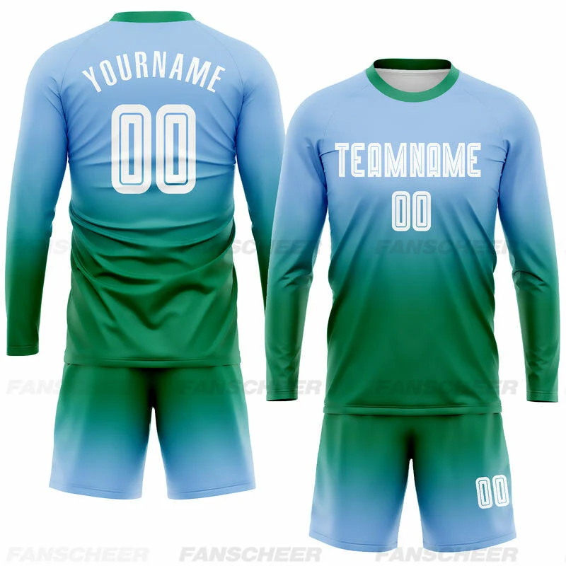
9) Blue+ Green + White(accent)
Fresh and playful; keep patterns subtle to avoid visual noise.
10) White + Black + One Neon Accent
A modern “training-to-matchday” look; neon works best as piping/cuffs.
Add a World Cup feel without over-designing
If you want the kit to feel “World Cup-level” while staying original:
- Add a subtle tonal pattern (micro-stripes, chevrons)
- Use a clean number font
- Add a small identity detail (collar piping, sleeve cuff)
Common mistakes (and how to avoid them)
- Too many bright colors → limit to 2–3 core colors
- Low contrast numbers → choose a number color that pops
- Busy patterns + busy colors → keep one element simple
FAQ
What are the best soccer jersey color combinations?
The best combinations create strong contrast for numbers and keep the kit consistent across jersey/shorts/socks. Black+gold+white and navy+white+red are reliable options.
Should we choose light or dark jerseys for tournaments?
Dark jerseys hide dirt and grass stains better, but light jerseys can look cleaner in photos. Many teams pick one dark home kit and one light away kit.
Already have a palette you like? Send your colors (or a reference image) and your team name—Fanscheer will help you turn it into a clean, readable custom jersey design.