

Jersey Color Psychology Team Color Combinations That Boost Morale, Identity, and Performance
Choosing custom jerseys isn’t just a design decision—it’s a leadership decision.
The right palette can make a team feel more united, confident, and “ready to compete” the moment they walk onto the field. It also shapes how fans remember you—and how opponents subconsciously read you.
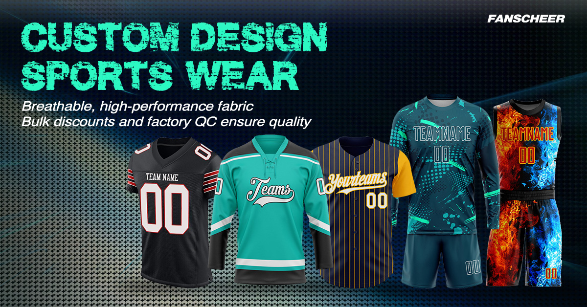
In this guide, we’ll break down jersey color psychology, explain the color theory behind great uniforms, and share team color combinations you can confidently use for your next custom order.
Why jersey colors affect how teams feel (and how others see them)
Uniform colors work like a visual shortcut. Before a single play happens, colors send signals:
- To your players:“We belong together.”
- To your supporters:“That’s our team.”
- To opponents:“They look organized, confident, and hard to break.”
A quick reality check: color isn’t magic. It won’t replace training or strategy. But it can influence emotion, perception, and identity—three things that directly impact morale.
The basics: color psychology in sports (what each color tends to communicate)
Below are common associations used in sports branding and uniform design. (Cultural context can vary, so treat these as strong “defaults,” not absolute rules.)
Red: energy, aggression, urgency
Red is often linked with intensity and action. Teams choose red when they want to look bold, fast, and fearless.
Blue: trust, calm focus
Blue is associated with stability and control. It’s a strong choice for teams that want a composed, disciplined identity.
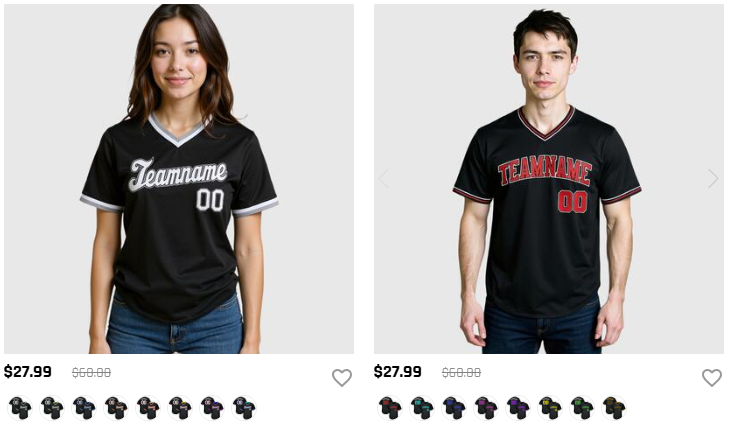
Black: authority, intimidation, premium
Black can feel powerful and serious. It also pairs well with bright accents for high-contrast, modern looks.
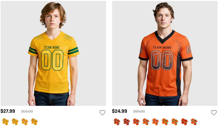
Yellow / Orange: optimism, visibility, speed
Yellow/orange can grab attention quickly. They’re great for energetic branding and for improving visibility on the field.
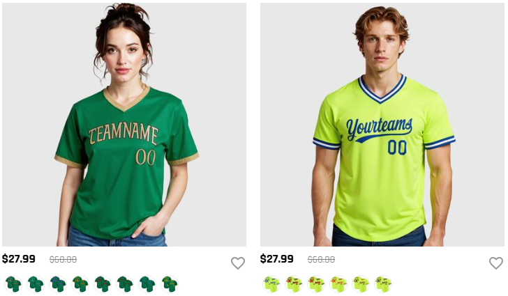
Green: balance, resilience
Green often communicates balance and endurance. Dark greens can feel traditional and “club-like,” while bright greens feel modern.
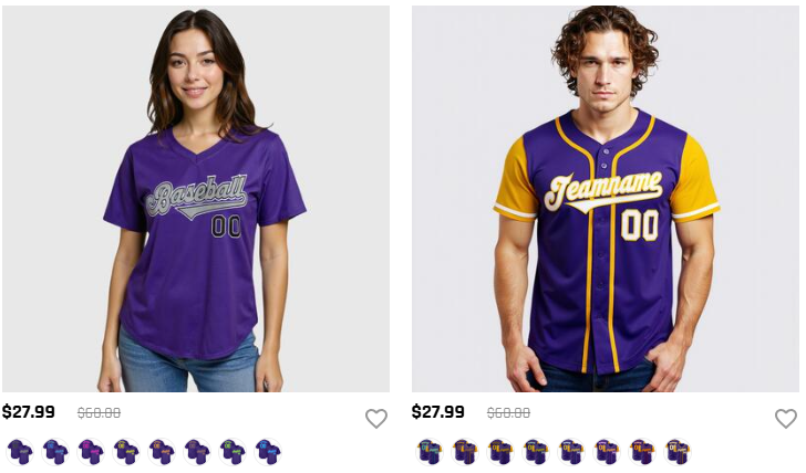
Purple: creativity, ambition
Purple can signal uniqueness and confidence. Paired with gold or white, it can look premium and memorable.
White / Gray: clarity, neutrality
White creates clean contrast and readability. Gray is a versatile neutral that can make accent colors pop.
Color theory for team jerseys: how to build combinations that look “right”
If you want your uniform to look professional (not random), use a simple color-system approach.
Complementary vs. analogous vs. triadic vs. split-complementary
- Complementary(opposites on the color wheel): high contrast, high energy (e.g., blue + orange).
- Analogous(neighbors on the wheel): smooth, unified feel (e.g., blue + teal + green).
- Triadic(three evenly spaced colors): bold but balanced (e.g., red + blue + yellow, with one dominant).
- Split-complementary: contrast without being too harsh (base color + two near its complement).
The 60-30-10 rule for uniforms
A reliable way to avoid over-designing:
- 60% primary (main jersey body)
- 30% secondary (panels, sleeves, shorts)
- 10% accent (trim, collar, small graphic hits)
Warm vs. cool palettes (and when to mix)
- Warm palettes(red/orange/yellow) feel energetic and aggressive.
- Cool palettes(blue/green/purple) feel calm, controlled, and strategic.
Mixing a cool base with a warm accent (like navy + gold) often creates a balanced “confident” look.
12 proven team color combinations (with the vibe + best use cases)
Below are practical team uniform color schemes that work across sports and levels.
1) Red + White + Black
Vibe: aggressive, high intensity
Best for: basketball, football, hockey, competitive clubs
Design tip: keep white for numbers; use black as trim for a sharp outline.
2) Navy + White + Gold
Vibe: disciplined, premium, traditional
Best for: soccer clubs, baseball, school teams
Design tip: gold works best as a controlled accent (logos/trim), not a full base.
3) Royal Blue + Orange + White
Vibe: energetic, modern, high visibility
Best for: fast-paced sports, youth teams
Design tip: use blue as the base; orange for side panels and small hits.
4) Black + Yellow
Vibe: intimidating, ultra-modern, “speed”
Best for: training kits, esports-style aesthetics, night games
Design tip: ensure yellow is used for numbers/trim; avoid too much yellow coverage.
5) Forest Green + White + Silver
Vibe: resilient, grounded, club identity
Best for: soccer, outdoor sports
Design tip: silver is great for subtle patterns and sponsor marks.
6) Purple + Gold + White
Vibe: ambitious, standout, premium
Best for: teams that want a unique identity
Design tip: keep typography clean; gold outlines increase legibility.
7) Red + Cream + Black
Vibe: heritage, toughness, mature
Best for: schools, alumni clubs
Design tip: cream softens the look and improves readability versus pure white.
8) Green+ Black + White
Vibe: fresh, confident, modern
Best for: teams wanting a contemporary brand
Design tip: green gradients work well with sublimation printing.
9) Light Blue + Navy + White
Vibe: calm confidence, technical, clean
Best for: soccer, basketball
Design tip: navy numbers on sky blue need a white outline for contrast.
10) Orange + Steel Gray + White
Vibe: bold, energetic, industrial-modern
Best for: baseball, basketball
Design tip: steel gray is a forgiving base that hides wear and looks premium.
11) Red + Navy + White
Vibe: competitive, classic, “team-first”
Best for: multi-sport programs
Design tip: choose either red or navy as the dominant 60% to avoid visual conflict.
12) Black + White + (one accent color)
Vibe: timeless, flexible, professional
Best for: new teams building identity
Design tip: pick one accent (red, gold, teal) and keep it under 10%.
Morale-first checklist: choose a palette your team will actually love wearing
Great jersey color psychology isn’t just about intimidation—it’s about buy-in.
- Identity: Does the palette reflect your mascot, city, school, or club history?
- Confidence: Do players feel good wearing it (fit, contrast, flattering tones)?
- Unity: Will it look cohesive across different body types and sizes?
- Merch potential: Would fans proudly wear it off the field?
Practical constraints that matter in real games
Even the best team color combinations fail if they don’t perform in real conditions.
Number readability & contrast
For readability, use light-on-dark or dark-on-light. Add outlines when needed.
Home vs. away jerseys
A simple system:
- Home: darker, bolder primary
- Away: lighter base with strong contrasting numbers
Indoor vs. outdoor lighting
Colors shift under different lighting. Always review mockups and (ideally) fabric samples under your typical venue lighting.
Fabric + printing method and color consistency
If you’re ordering custom jerseys, consistency matters across reorders and bulk sets.
- Document your color values (Pantone/HEX/CMYK)
- Confirm how your printing method (especially sublimation) renders gradients and bright accents
FAQ
What are the best color combinations for jerseys?
The best combinations balance identity + contrast + simplicity. For most teams, 2–3 colors using a 60-30-10 split is the safest, most professional approach.
Do red jerseys really win more?
Some research suggests red can be associated with dominance in certain contexts, but performance is multi-factor. Treat color as a morale and identity tool—not a guaranteed advantage.
How many colors should a team jersey use?
Most teams should use two or three. More colors can work, but it increases complexity and raises the risk of poor contrast.
How do we pick colors for a team of 10+ players?
Get quick buy-in: shortlist 2–3 palettes, show mockups, and vote. Prioritize readability, comfort, and a look that players feel proud to represent.
Ready to design a morale-boosting custom jersey?
If you want a palette that looks professional and feels powerful on the field, start with a few proven team color combinations above—then refine with your logo, sport, and venue lighting.
At fanscheer.com, we support bulk team orders and can help you finalize colors with consistent matching and clean number contrast. Request a mockup and we’ll help you turn your team identity into a jersey players love wearing.